Giving an AI strategy platform the presence of a premium service.
The platform was built fast with AI, and it worked, but it hadn't caught up with the brand selling it. The job was to bring UX thinking into the interface, so the product felt as considered as the promise.
 Product under NDA
Creative Engines helps brands find the mindsets and stories behind their marketing.
The website and the product needed to feel like one brand, and like something worth paying for.
one brand, two lives.
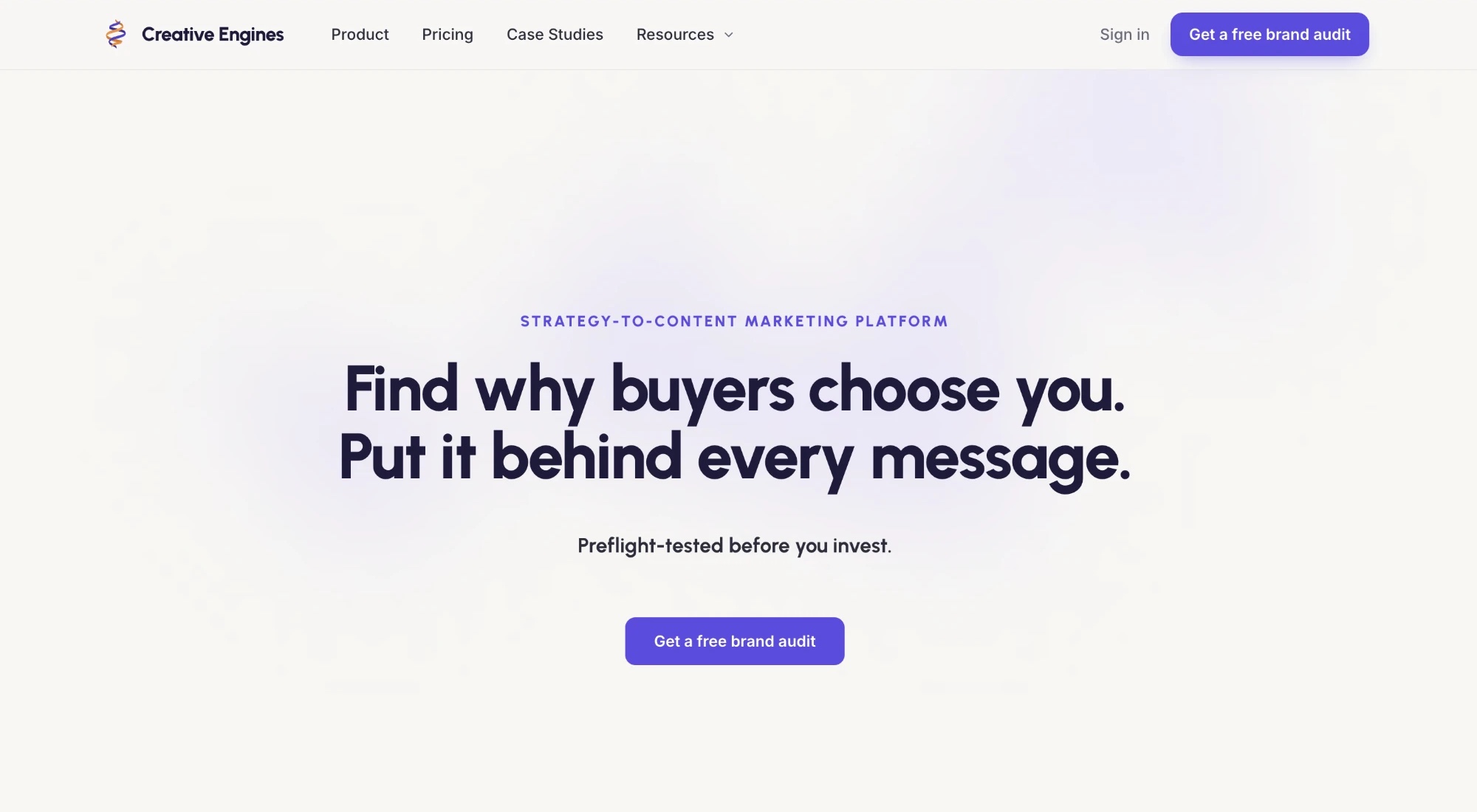
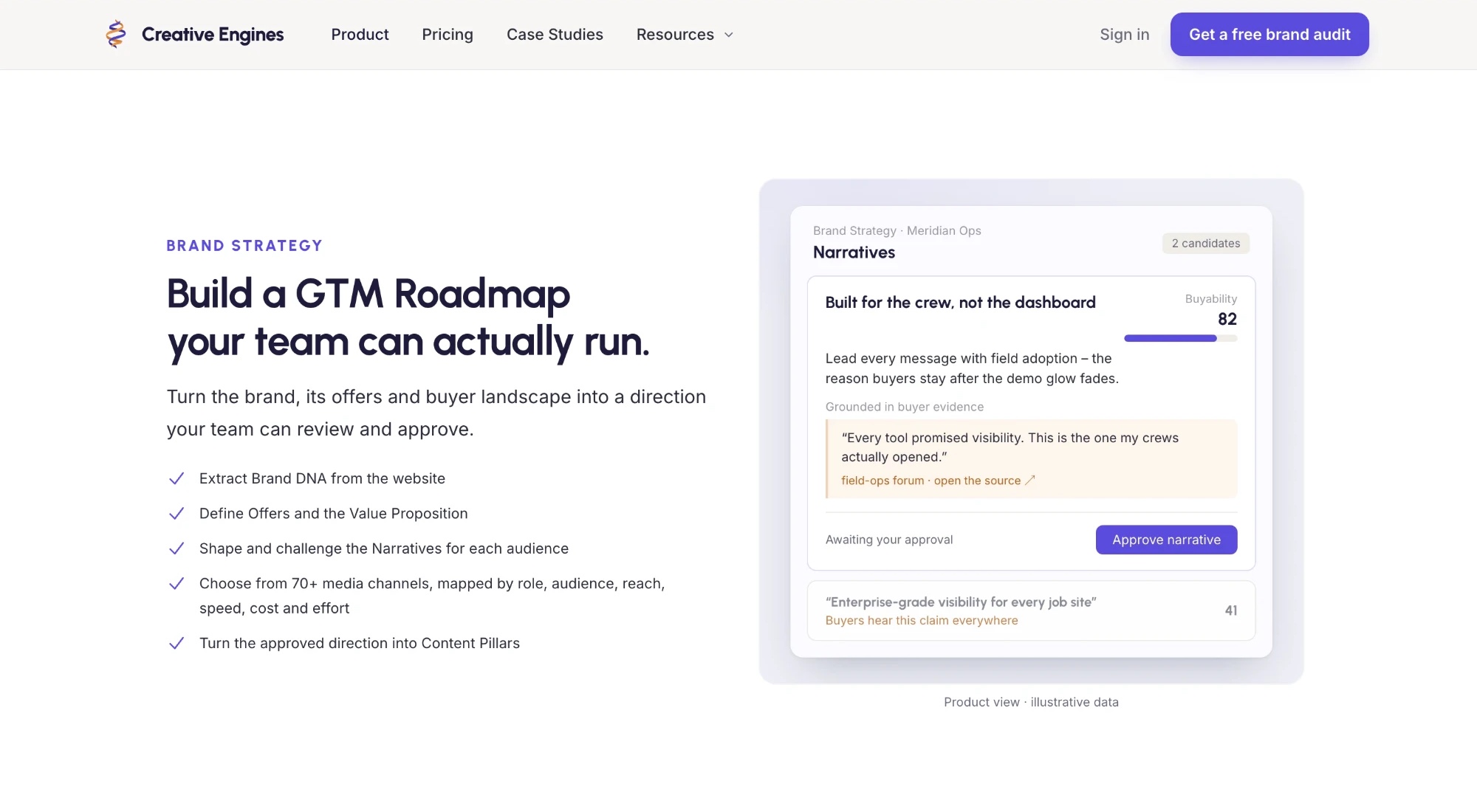
The website and the product grew up separately. The site sold a premium strategy service; the product did its job, but it didn't yet look like something worth paying for. The two needed to feel like one brand.
a crowded category, and a pushback.
The client's team had mapped nineteen competitors. Almost all of them reach for the same moves:
The research pointed to a bold, editorial look as the way out. We argued against it for the product: a website makes a first impression and can afford to be louder, but a product is used every day and has to stay calm and readable, down to the smallest table text.
So the brand stayed as it was, and the difference came from a few deliberate details: the layout, and a frame users can make their own.
from empty account to first result.
Every step was used the way a new customer would, from sign-up to the first piece of content. That gave 41 findings across 9 areas, each marked as a quick visual fix or a deeper UX change. For example:
- Empty pages that explain what to do next, not one generic placeholder
- Menu names that match the page they open
- One header style for every pop-up
- A way back in every step-by-step flow
”Nothing was broken — it just hadn't caught up with the brand selling it.
no brand book, so we read the code.
There were no brand files to start from, so the colours, type and corner styles were pulled straight from the live website's code and matched against the product.
The result is one set of design rules for both, written precisely enough that the AI tools building them make the same choices.
Warm off-white
#F8F7F4Background, on the site and now in the product
Ink
#2D2D3AText
Deep navy
#1E1B3AHeadings, dark sections
Indigo
#5B4CDBButtons, links, the selected page
Light indigo
#EEEAF9Chips and soft fills
Amber
#E8964FOnly for what the AI does — never on buttons
a layout the category doesn't use.
Almost every competitor puts a sidebar next to a page. Here, the product sits inside a soft coloured frame that users can change, and a single warm accent marks only what the AI does.
Creative Engines works with many brands, so each team can make the product its own: pick a frame colour, and the interface adjusts around it.
New Content and Chat pages followed in the same system.
working pages, not pictures.
Every design was built as a real page you can click through in a browser, then shared through the client's own code system, so the team could review it and take what was approved straight into the product.
From first look to handover in twelve days.
First look at the product
Colours and type read from the website, UX review written
Three layout directions, each a working page
Competitor research challenged
Calm direction agreed
Final pages and design rules handed over
redesigned in twelve days, still in the loop.
Everything was handed over as working pages and written rules, ready for the team to build from.
UX review
41 findings across 9 areas.
Design rules
One set for the site and the product.
Product pages
Handed over for development.
Marketing website
Ongoing design support.
Creative Engines — UI/UX
Back to work